top of page


IHOP Brand Refresh
Brand Refresh
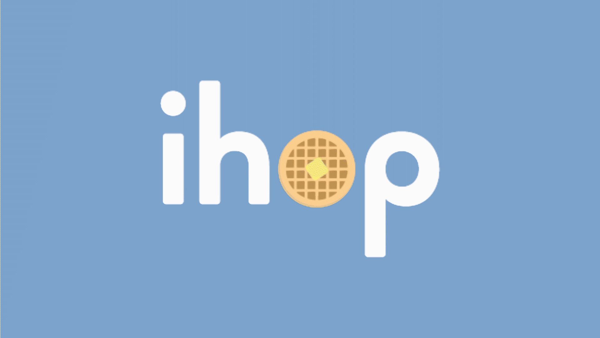
This is a personal project in which I picked an existing company that needed a rebrand. I chose the popular American breakfast chain "IHOP" (International House of Pancakes). As someone from Hong Kong who first came across the restaurant in the United States, I was unsure of what the name IHOP" meant. So I created a dynamic logo identity that swapped the "O" in the name IHOP with various food items to make what the restaurant was selling more clear to consumers. I also used a lowercase sans serif typeface and a brighter color scheme to create a lighter and happier feel— the way you should feel when you start your day with a whole and hearty breakfast! Year: 2018 Scope: Art Direction Logo Identity Brand Refresh


bottom of page